I was recently meeting with a client who needed to replace their multi-worksheet-excel workbook (that they're using as a database) with a real world database.
Of course they wanted to not just replace the main worksheet (with complicated formulas and fancy charts) with a web-based application, but they then asked about apps for phones and tables.
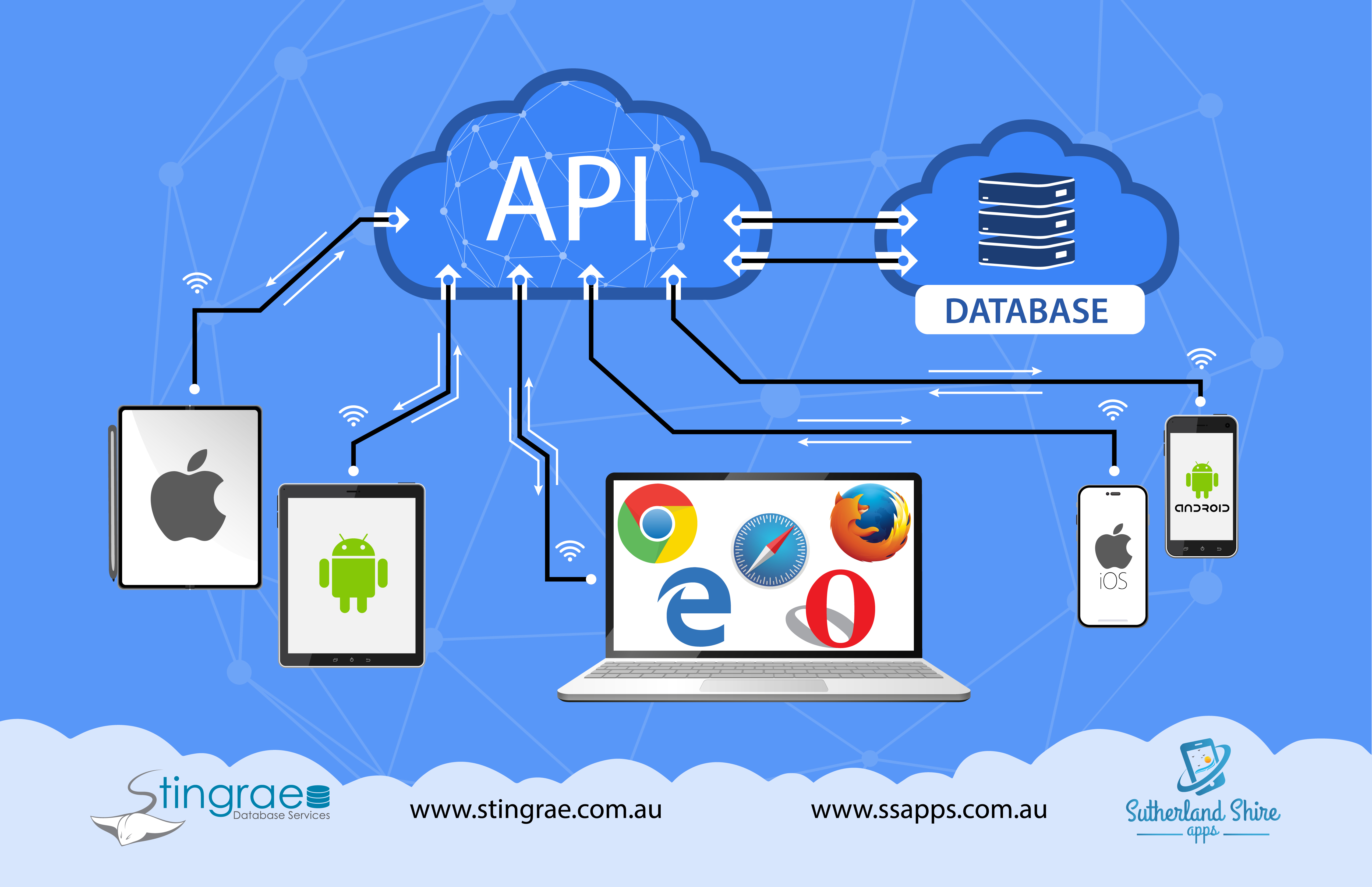
In order to explain to them how I would replace this Excel workbook with a real system, I went to google and tried to find a decent looking infographic of a 3-tiered or n-tiered application design.
Unfortunately, there were no real good ones. They looked like they were done by computer programmers, not graphical designers!
Therefore ... I sourced a designer to create one!
It's not too fancy, but I think it does a good job of explaining the basics of linking together a cloud-based database, with an API and then as many different presentation layers as possible.
What do you think?